Creating Multi-Column Field Layouts in Modern UI
Suppose you're extending the Shipments (SO302000) screen.
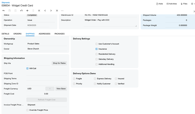
The customer requests a new section called Delivery Options, containing several shipment flags.
Instead of displaying each checkbox on a separate line, the desired layout is a compact group of checkboxes arranged in two rows.
Consider the following DAC extension containing several custom fields:
// Acuminator disable once PX1016 ExtensionDoesNotDeclareIsActiveMethod extension should be constantly active
public sealed class SOShipmentExt : PXCacheExtension<SOShipment>
{
#region UsrFragile
[PXDBBool]
[PXUIField(DisplayName = "Fragile")]
public bool? UsrFragile { get; set; }
public abstract class usrFragile : PX.Data.BQL.BqlBool.Field<usrFragile> { }
#endregion
#region UsrExpress
[PXDBBool]
[PXUIField(DisplayName = "Express Delivery")]
public bool? UsrExpress { get; set; }
public abstract class usrExpress : PX.Data.BQL.BqlBool.Field<usrExpress> { }
#endregion
#region UsrInsured
[PXDBBool]
[PXUIField(DisplayName = "Insured")]
public bool? UsrInsured { get; set; }
public abstract class usrInsured : PX.Data.BQL.BqlBool.Field<usrInsured> { }
#endregion
#region UsrPriority
[PXDBBool]
[PXUIField(DisplayName = "Priority")]
public bool? UsrPriority { get; set; }
public abstract class usrPriority : PX.Data.BQL.BqlBool.Field<usrPriority> { }
#endregion
#region UsrNotify
[PXDBBool]
[PXUIField(DisplayName = "Notify Customer")]
public bool? UsrNotify { get; set; }
public abstract class usrNotify : PX.Data.BQL.BqlBool.Field<usrNotify> { }
#endregion
#region UsrVerified
[PXDBBool]
[PXUIField(DisplayName = "Verified")]
public bool? UsrVerified { get; set; }
public abstract class usrVerified : PX.Data.BQL.BqlBool.Field<usrVerified> { }
#endregion
}
These fields belong to the shipment document itself, so we simply extend the existing CurrentDocument view.
Default Behavior
If these six fields are added normally, Modern UI renders them one below another.
For groups of related fields, this often creates unnecessary vertical space and reduces readability.
Our goal is to display these checkboxes in two rows with three columns each.
Building a Custom Layout
To arrange multiple controls on the same row, create an unbound field and replace its content with custom controls.
The important part is:
<field name="row1" unbound replace-content>
Normally, a <field> element renders a single control that corresponds to a DAC field.
When unbound and replace-content are used together, the field becomes a layout placeholder instead. Rather than rendering a single control, it allows you to define any custom arrangement of qp-field controls inside it.
In this example, each placeholder represents one row containing three checkboxes.
The col-4 class divides the available width into three equal columns, while no-label hides the individual field labels since the checkbox captions already provide the necessary text.
This approach is useful whenever the default vertical layout is not sufficient and you need to build a cleaner, more compact user interface.